Welcome to 2021! Are you as excited as I am to be done with all the garbage of 2020?
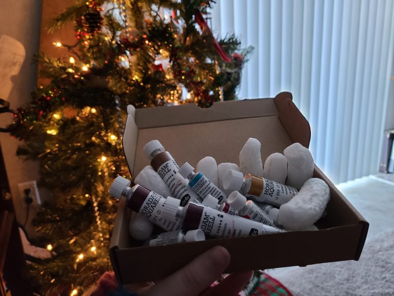
Well, one thing from 2020 is having a positive effect on me this year! I was gifted my very first set of professional watercolor paints for my birthday (in December). I picked out the 10 colors and hand-poured them, which was tons of fun, but picking colors took me several months of research! I wanted to share with you what I researched, and why.
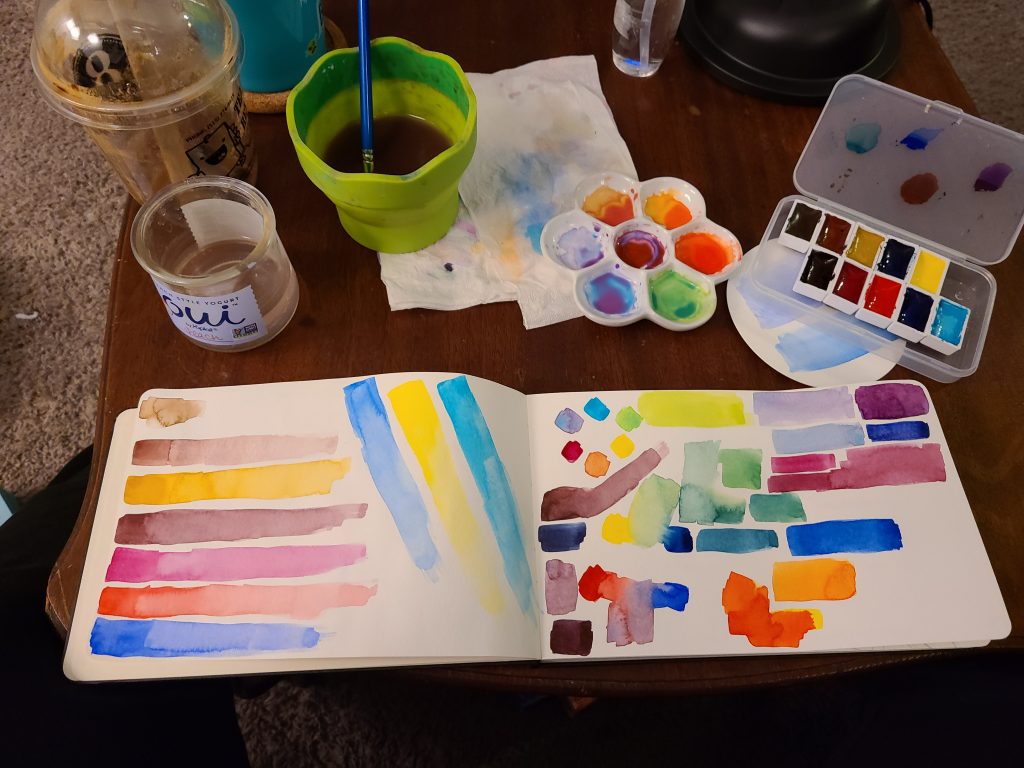
I actually recorded myself pouring these paints, If you want to see me be confused about colors. I am working on editing the follow-up video where I attach the dried pans to a container.
I did ALSO realize I wanted two more colors, which I talk about in the second video, and I just got the last two colors poured last night! So, keep an eye on my YouTube.
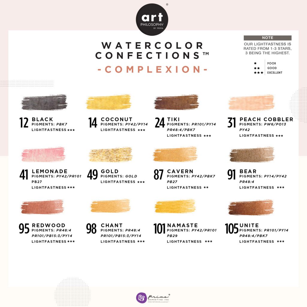
Prima Marketing complexions
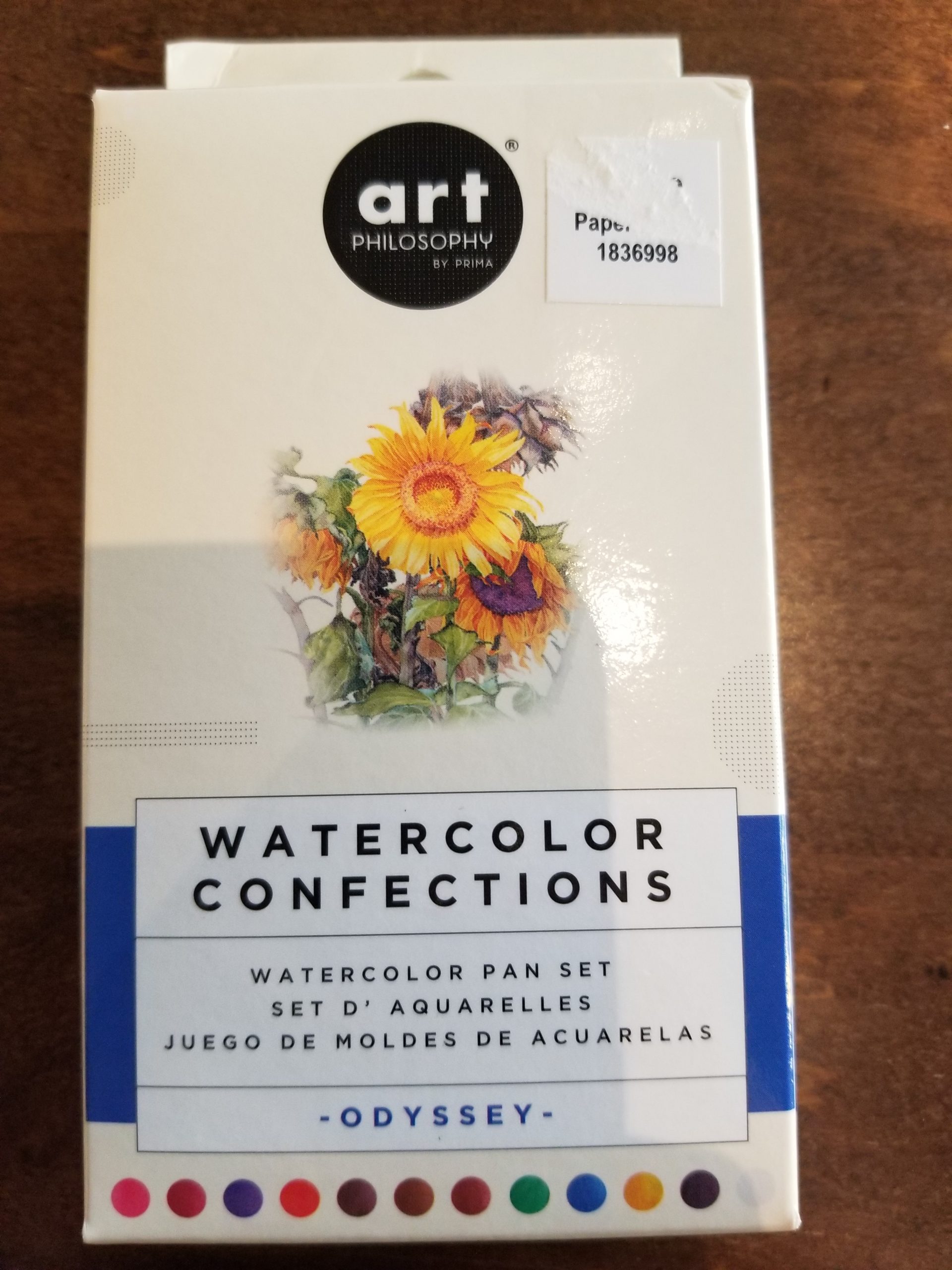
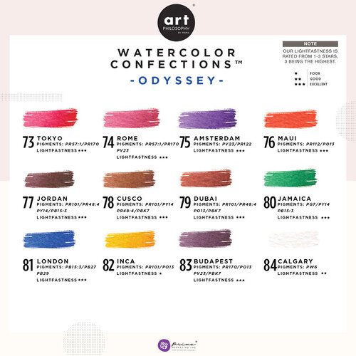
Prima Marketing odyssey
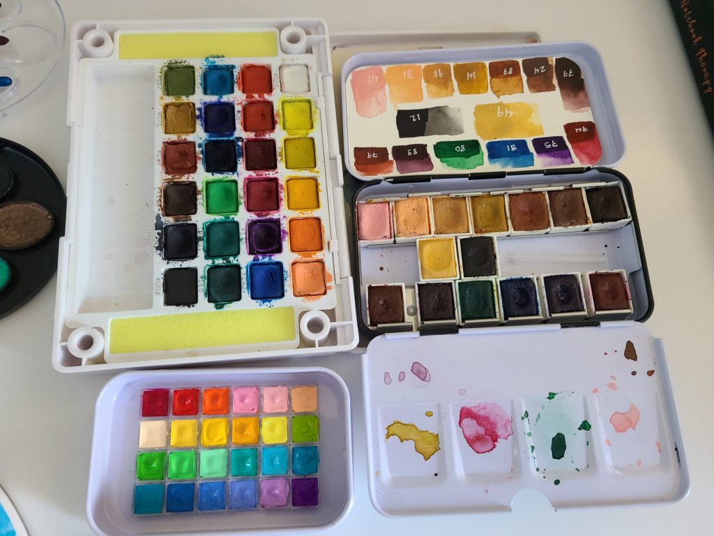
Sakura Koi, mini Holbein, and my franken Prima Marketing set
First I want to show where I was starting from, the colors I already had that influenced my choices of how I paint and what colors I wanted access to.
I want to share my resources and where I got my information as I will reference it often in explaining why I arrived at the colors I did.
Another important factor is that I primarily draw and paint people, so I needed a range of options for skin tones. This was the hardest part of my research, by far. Most YouTube artists, and well any watercolor painter, will tell you that there is no “set” or “perfect” palette. This is one of those things that heavily preference and depends on what you paint and how you go about painting it. They aren’t wrong to say this, but I found it supremely frustrating that no one would point me in a direction of where to even start! It felt like they were guarding some kind of secret…
I had to get more creative with how I asked google and youtube for help. This is where my existing paints came into play. I looked up the pigment information of the prima marketing paints I had, hoping they would have names of the colors they were trying to duplicate (they didn’t). I started to really think about what colors I was using most and rearranged my paints a few times to single it down to what was actually helping me to get skin tones I liked.
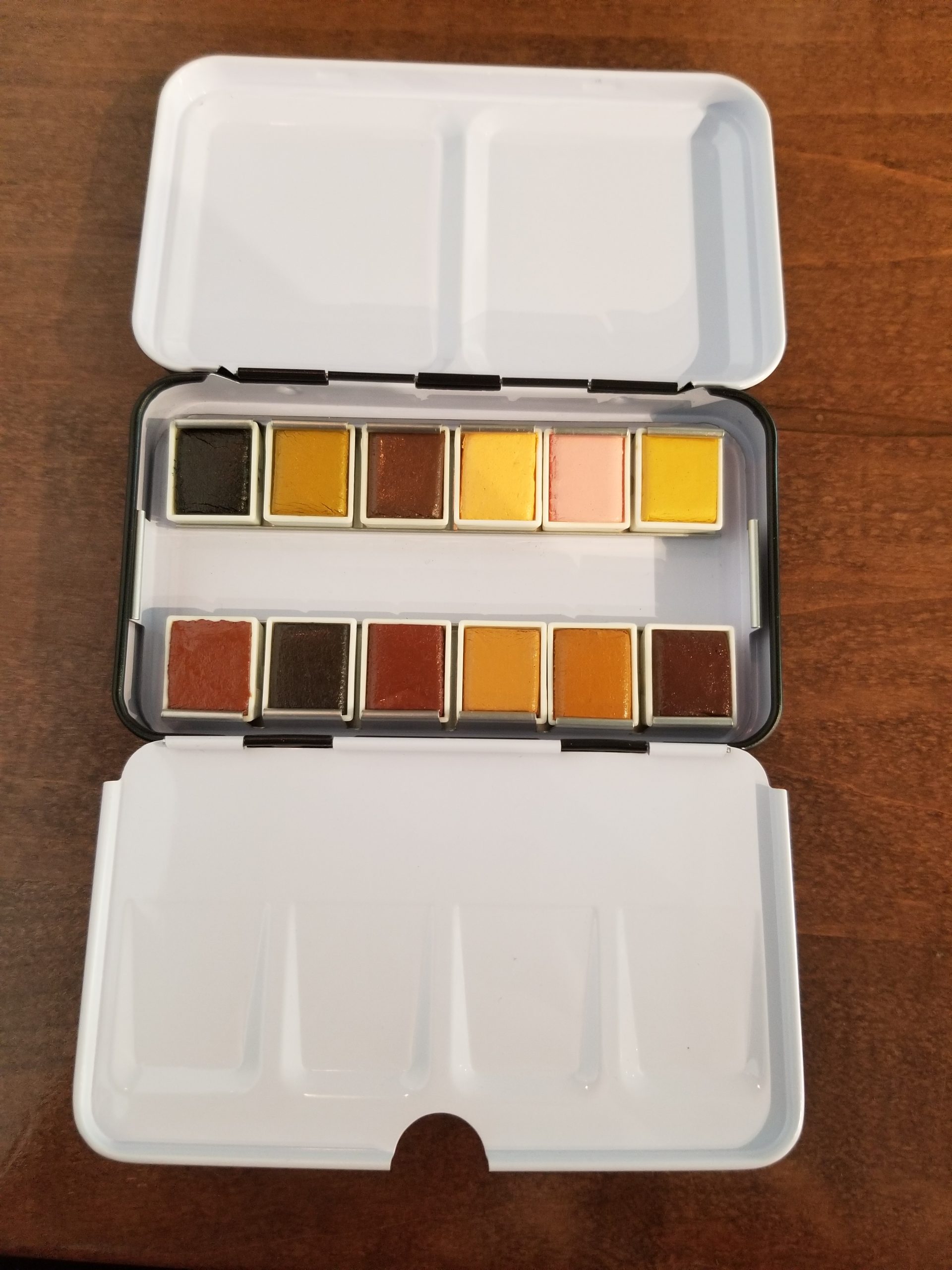
I realized quickly that the Complexions palette wasn’t nearly as helpful as I had assumed it was. Mostly because I paint skin in layers of warmth, neutrals, and cool tones rather than using a flat tone. So, even if some of those colors were close to what I wanted, not only could I not do all my colors from such a monochromatic selection, I found myself mixing in colors from my other paints.
After buying the Odyssey palette I discovered that not only did I enjoy painting from it FAR more, it also had some hidden gems in it. Namely: 79 and 83. I found that I used these two the most out of either set. 79 Dubai has a nice warm rusty color that made more convincing flesh tones when mixed with 98 Chant, 87 Cavern, and 91 Bear and was more of a subtle blush color. I used 83 Budapest as my main shadow color, when diluted it has a warm purple that casts realistic shadows for something as warm in tone as a face. Because these more moody colors were also more fun to paint with, in general, they both helped make more interesting paintings overall.
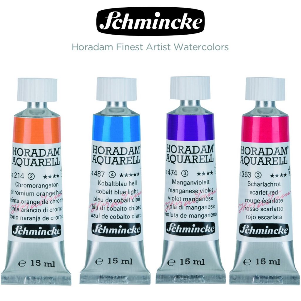
When it came to what brand of paints I wanted to get, I was looking for something that was not granulating as I wanted to have nice even skin tones. From my research, I was eyeing Sinnelier, Holbein, and Schmincke.
I ended up going with Schmincke purely because they were the only one of the three that had all the colors I was looking for. I also opted for full pans so my larger brushes will fit in them easily. Because I knew I would use the skin tones more than the other colors, I got the 15ml tubes for those, and just the 5ml tubes for the mixing and “fun” colors.
Proper swatches showing off the colors
messing around with mixing
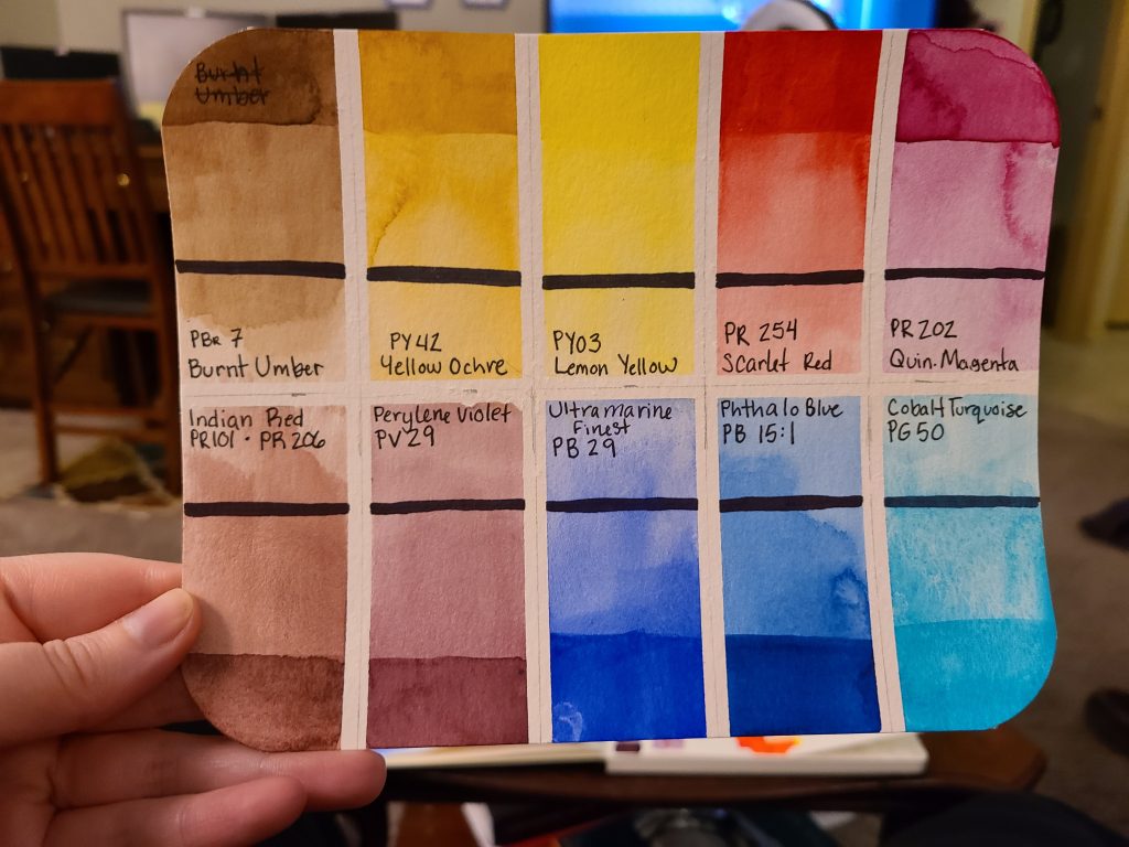
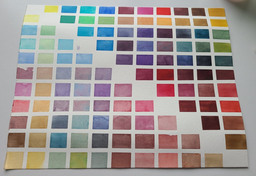
mixing chart of my new colors, showing all the possibilities